
Big data is a term that has been all the rage since 2010 but now when the hype is being translated into actual applications—it’s a good time to learn about what it means, and how it works. Data analysis, on its own, has been a cornerstone of scientific research for a long time. It has also helped corporations understand their market and their customer base while synthesizing actionable insights to increase their sales and the impact of their marketing messages. As the number of nodes that corporations can probe into has increased, thanks to cellular technology and IoT, the word big was added into the mix. Now organizations have terabytes of data to sniff through. They have a choice to remain dormant or use Big Data Analysis to understand the story behind those numbers and shape their strategies accordingly.
According to Wikipedia, Big Data Analysis differentiates itself from Business Intelligence on the basis that it makes use of Inferential Statistics over Explanatory Statistics. As the name implies, Inferential Statistics is used to predict the behaviour of variables beyond the current dataset whereas Explanatory Statistics is used to make judgements about the data at hand. Creating regression models is one of the examples of Inferential Statistics whereas mathematical operations such as finding the mean, median and skewness of a distribution are placed under the umbrella of Explanatory Statistics.
We all know that each time we open a webpage, we leave our footprint on the website’s server. While some web requests are explicitly made by us, there are a lot of requests that are made on our behalf — sometimes unbeknownst to us. For example, Internet of Things devices relay back scores of data to their parent server about our activity on a daily basis. According to Cisco, the World IP traffic in 2016 will reach an astounding 1.1 Zetabyte (1 Trillion GB). This avalanche of data has brought big challenges for businesses but amidst them, there are scores of opportunities too.
Let’s consider an example of how Data analysis can give you interesting insights about almost anything. I went on Wikipedia and gathered (read copy/pasted) data regarding 80 different countries. The arbitrary parameters that I am taking into account are GDP Per Capita, Population Growth Rate, GDP Growth Rate & Happiness Index. With any data set, you are bound to have some hypotheses about the correlation between various parameters. The hypotheses that I want to test are as follows:
H1: “The happiness index of a Country is directly proportional to its GDP Per Capita”
H2: “The population growth rate of a Country is more strongly linked with its GDP growth rate than its GDP Per Capita”.
The basis for the first hypothesis is a much debated question in the contemporary popular culture: “Can money buy happiness?” The second question is rooted in the fact that some European Countries with above average GDP per Capita are facing a negative population growth rate. I will get back to these hypotheses towards the end.
I have used a combination of the R Language and Excel for my analysis. The raw data can be found here.
Raw data link: https://docs.google.com/spreadsheets/d/1Z6I1oVij8qevUL8weMf6lxIR9EWIiwZfOCij-9Jzoic/edit?usp=sharing
Let’s start by running the basic functions of Explanatory Statistics to answer these questions:
Which countries are leading or lagging within each category?
Which countries reside in the middle?
Here are the results:
There are some interesting observations to be made from the above data. For example, Portugal, a first world country, has the lowest Happiness Index in the list of 80 countries that contains some third world countries as well. Another interesting anomaly is Greece which, even with its financial crisis, still has an average GDP per Capita. Libya’s -19.8% GDP growth rate can be traced back to the civil war that has the country in turmoil for quite some time now. It’s amazing to see countries like Turkmenistan & Oman being outliers in the GDP Growth Rate & Population Growth Rate categories, respectively. At the current rate, Oman’s population is set to double in the next 7 years.
Carrying forward the same line of thought, let’s consider box plots of each variable and study the distribution of data points and see if there are any outliers. Let’s start with Happiness Index:
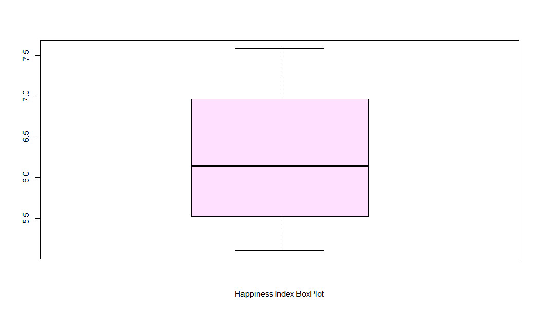
The line in the middle represents the median. The area at the top half of the box represents the density of data points above the median. The line at the top, disconnected from the box, is the highest data point which represents Switzerland in the current context. The same logic applies to the bottom half of the box. As we can see, happiness index is almost normally distributed with a little negative skew (higher population above median).
Let’s see what GDP Per Capita boxplot has to reveal:
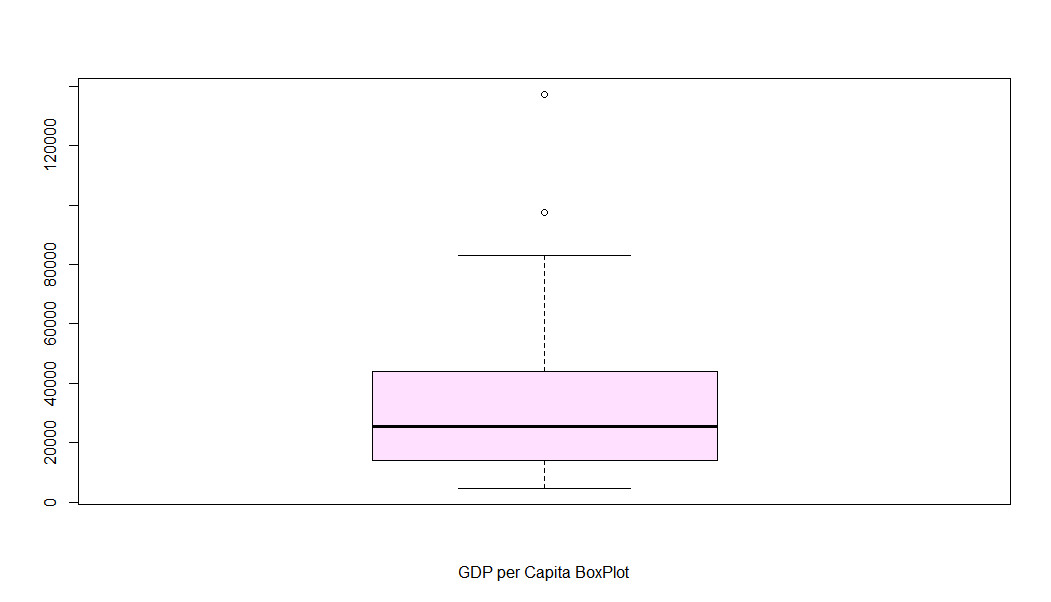
GDP per Capita boxplot has almost the same characteristics as Happiness Index boxplot with two exceptions: the variance between majority data points isn’t that high and we have two outliers represented by two dots at the top. These outliers are Qatar and Luxembourg, respectively. It turns out; Qatar's GDP per Capita is almost 5 times that of Greece, the Country with an average GDP.
Let’s proceed to GDP Growth Rate:
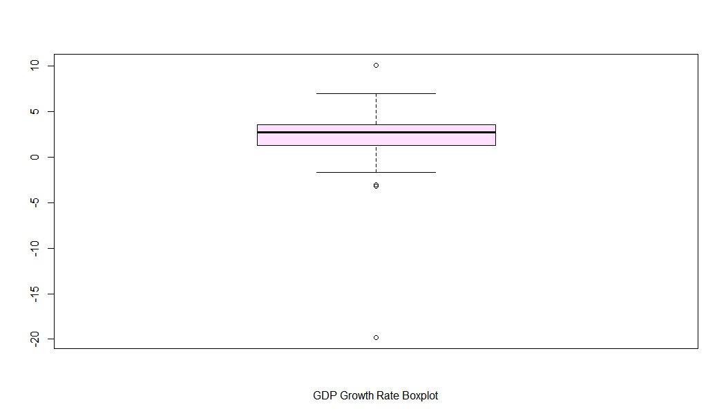
In case of GDP Growth Rate we have 4 outliers; Turkmenistan which has, as discussed above, the highest GDP growth rate and Libya, Cyprus & Venezuela which represent the bottom three countries in this category. It’s interesting to see Cyprus & Venezuela among the outliers. Venezuela suffered from plummeting oil prices and political turmoil whereas Cyprus is facing the same debt related problems as Greece.
Moving on, the population growth rate has the following story to tell:
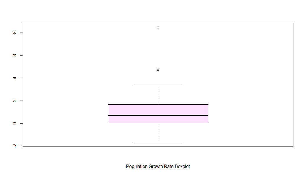
It’s apparent from the above that Population Growth Rate distribution has the closest resemblance to a normal distribution with two outliers. Those are Oman and Lebanon. With average household sizes of approximately 7 & 5, respectively, it’s no surprise that the population of these countries is growing at a rapid rate.
I would like to study GDP Per Capita a bit more. Qatar seems to have a significant lead over other countries. Visualizing it through a bar graph yields the following result:
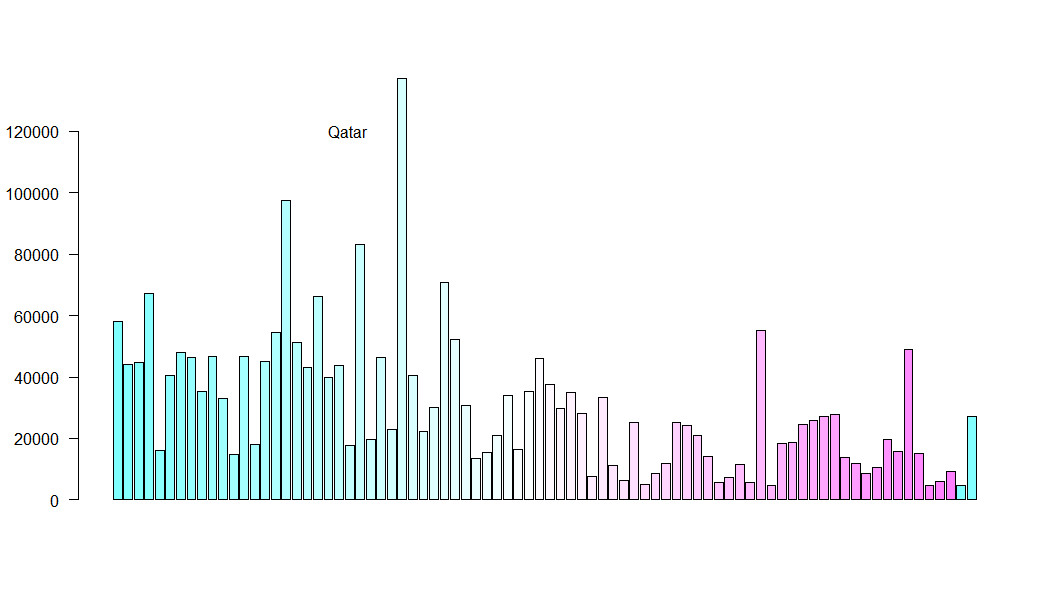
Qatar’s oil wealth coupled with a relatively small population makes its GDP tower over the rest of the countries.
One of my favorite statistical analyses is cluster analysis which provides interesting insights particularly for marketing applications; dividing the target market base into separate entities for companies to tailor their messages accordingly. Conducting hierarchical cluster analysis of the above data while taking into account all the parameters gives us the following picture:
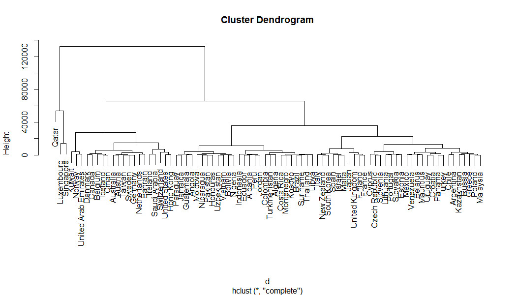
I admit that the above diagram is a bit busy however I would like to draw your attention to the clusters at the extreme left. Qatar resides in a league of its own whereas Luxembourg & Singapore are also grouped together isolated from the rest. It’s apparent that GDP Per Capita played a significant role in deciding their respective positions.
At last, let’s step into the interesting world of Correlation Analysis. Drawing up a quick bubble plot to represent Population Growth Rate, Happiness & GDP Per Capita, we get:
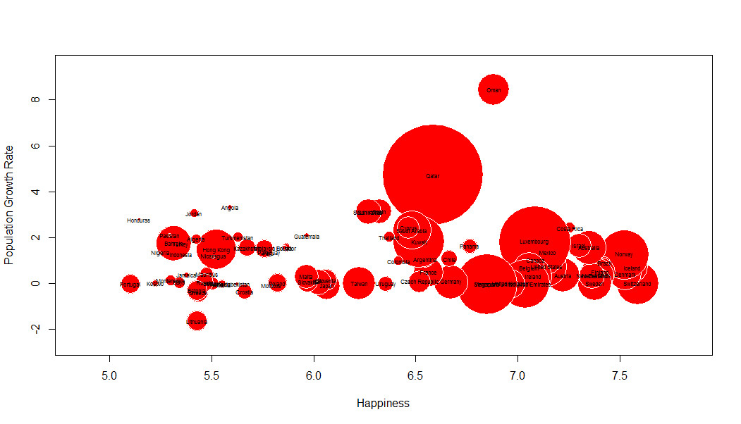
For our first hypothesis to be true, the size of the bubbles, which represents a country’s GDP should increase as we move towards higher values of Happiness Index. Even though it’s not clearly discernible from the above picture, we can say with some confidence that most of the small circles are situated towards the left of the graph, hence GDP Per Capita does have some effect on a country’s Happiness Index. The same could not be said for Population Growth Rate.
Consider the following table:
The above Correlation table provides us with some interesting insights. Remember, a value of 1 translates to a strong positive correlation, a value of -1 represents a strong negative correlation and 0 represents no correlation at all. Happiness Index and GDP Per Capita have a somewhat strong correlation hence it’s safe to say that statistically speaking, money can buy you happiness. The other correlation worth mentioning is the one between Population growth rate and GDP Growth Rate. The value of 0.237 isn’t that significant but it is higher than 0.117, the correlation between GDP Per Capita and Population Growth Rate. Hence, we can say that Population Growth Rate is more a function of a Country’s GDP growth rate than its current GDP Per Capita.
Mathematics is ingrained in all aspects of our daily lives. Mathematical patterns such as Fibonacci sequence and Benford’s law tend to show up in the most unexpected places. For a long time we were restricted to just observing those patterns. Now, with the advent of technology, we can make real time changes based on Big Data Analysis to evolve our systems to work more efficiently. The above example was just a glimpse of what we can decipher from a small numerical dataset. Now imagine what online businesses are able to achieve with unimaginable data points about our behavior on and off the internet.